When we log in to the background of the Linode vps host panel, we will see a lot of graphs. When I started to use it, I was a little afraid of seeing such fluctuating graphs. Is the traffic or resources exceeding the standard. In fact, other panels we often use also have such icons, but Linode is directly displayed in the interface, and other panels can be viewed only after we click. Of course, we can also check the usage of VPS through the probe or SSH command.
Today, Lao Zuo will share the traffic graphs with you. What does it mean? Especially suitable for beginners. Don't get dizzy when you see the curve like I did at that time. Master, don't laugh.
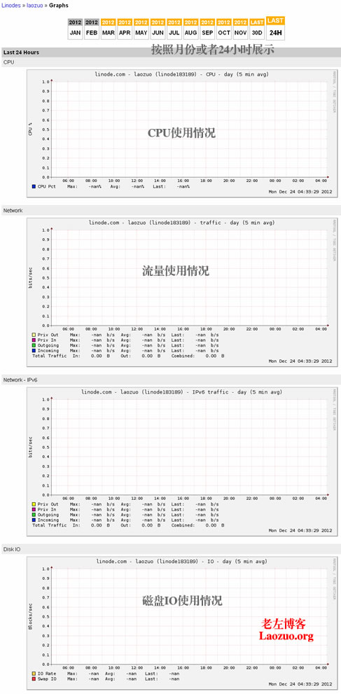
Detailed explanation of Linode VPS traffic diagram (Graphs)