Many people usually choose to put a hover on the side of the webpage Online Service It is convenient for interested customers to contact. A random search on the Internet will also provide many codes, but most of them are written by JS, with some pictures and materials mixed up, which is very inconvenient to use.
Today we will teach you a pure css written online customer service effect
First, we have the following html structure
<div class="sideBar"> <div> <div class="tips">Online customer service</div> <ul class="list"> <li>QQ:48846110</li> <li>QQ:48846110</li> <li>QQ:48846110</li> <li>QQ:48846110</li> </ul> </div> </div>
The above structure is very simple. Online customer service is a button, and the following li is the specific contact information. Of course, you can add QQ's online link directly, for example:
<a href=" tencent://message/?uin=48846110& ;Site= Beautiful theme & Menu=yes">48846110</a>
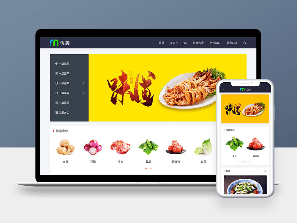
The effects we want to achieve are as follows:

First, the online customer service text is displayed vertically, and only needs to limit the fixed width
.tips{ box-sizing:border-box; width:40px; padding:10px 10px; height:120px; line-height:25px; }
The style of li is of course very simple
.sideBar .list { list-style:none; width:120px; padding:0; margin:0; }
Next, we need to consider the problem of positioning
one The outermost big box, sideBar, we need Fixed positioning We all know that although this is also part of Absolute positioning , but it is relative to the browser window. We need it to be in a certain position of the browser all the time, so it is more appropriate to use it.
.sideBar { position:fixed ; }
two . The online customer service needs absolute positioning. Why use absolute positioning? We know Absolute positioning is relative to the nearest relative parent element , because we need online customer service to be displayed on the left side of ul, it is appropriate to use absolute positioning here.
Then its parent element should be set to relative
.sideBar>div { position:relative; }
three After completing the above steps, we need to make some adjustments to their initial positions
1. The position of online customer service tips needs to be moved to the left of ul
.tips{ position:absolute; left:-40px; top:50px; }
2. What we need to display is only online customer service, and the specific contact information will be displayed only when the mouse floats up, so we need to move the outermost sideBar to the right
.sideBar { position:fixed; right:-122px; top:250px; }
3. When the mouse floats up, it will be displayed
.sideBar:hover { right:0; }
Then we add some auxiliary styles, such as borders, rounded corners, and backgrounds, to form our final effect
Complete code attached:
<!doctype html> <html> <head> <meta charset="utf-8"> <title>Teach you to create a side bar floating online customer service with CSS</title> <style> .sideBar { position:fixed; right:-122px; top:250px; background-color:#ffffff; border:#45B6F7 solid 1px; transition:right 0.5s; } .sideBar:hover { right:0; } .sideBar>div { position:relative; } .sideBar .tips { position:absolute; height:120px; line-height:25px; background-color:#45B6F7; width:40px; left:-40px; top:50px; text-align:center; box-sizing:border-box; padding:10px 10px; border-top-left-radius:5px; border-bottom-left-radius:5px; font-weight:bold; color:#ffffff; } .sideBar .list { list-style:none; padding:0; width:120px; margin:0; } .sideBar .list>li { cursor: pointer; padding:15px; border-top:#45B6F7 solid 1px; } .sideBar .list>li:hover { background-color:#45B6F7; color:#ffffff; } .sideBar .list>li:first-child { border-top:none; } </style> </head> <body> <div class="sideBar"> <div> <div class="tips">Online customer service</div> <ul class="list"> <li>QQ:48846110</li> <li>QQ:48846110</li> <li>QQ:48846110</li> <li>QQ:48846110</li> </ul> </div> </div> </body> </html>
Online Demo