Futures investment skills
(5) Graphic analysis
The graph provides a brief price history, which is the most basic information element for any trader. Graphs can give traders a good sense of market fluctuations, which is important for predicting risks. Graphs can be used as a tool to select market entry opportunities. Traders who use basic analysis methods should also use graphs to determine market entry opportunities. Graph is also a tool for fund management, which can be used to determine the specific price of stop loss. Graphics reflect market behavior, especially some types of repetition.
To form a valuable technical trading system, it is a prerequisite for traders to master graphic analysis. In technical analysis, graphic analysis is the most important and common analysis method, including the following three basic price graphs.
① K line diagram
The K-line chart originated in Japan and was used by Japanese rice market traders to record rice market quotations and price fluctuations at that time. Later, it was introduced into the futures market and stock market due to its exquisite and unique marking method. Because the chart drawn by this method looks like candles, it is also called candle chart. In the K line chart, the vertical axis represents the price and the horizontal axis represents the time. According to different time units, the K line chart can be divided into time sharing chart, daily chart, weekly chart, monthly chart, etc. The drawing of the K line chart is relatively simple. Taking the daily line chart as an example, the two tips, the upper shadow line on the top and the lower shadow line on the bottom, represent the highest price and the lowest price of the day, respectively. The rectangle like a candle in the middle indicates the opening price and closing price of the day. In Figure 1 below, the market situation of low opening and high closing is recorded, that is, the closing price is greater than the opening price, which is called the positive line; In the figure, the solid part is shown in white. In Figure 2, the market situation of high opening and low closing is recorded, that is, the opening price is greater than the closing price, which is called the negative line; In the black and white image, the solid part is represented in black. Because the price fluctuation is different every day, the shape of the Yin line or Yang line appears every day is also different. In order to enhance the visual effect, red is usually used to represent the male line and blue is used to represent the female line. By observing the K line chart, we can clearly see whether the market situation on that day is "open low and close high" or "open high and close low", which is vivid, intuitive and practical.
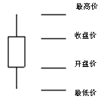
Figure 1: Male Line

Figure 2: Internal thread
When analyzing the shape of the K line diagram, in addition to its basic shape, the following points should also be noted:
First, pay attention to the length relationship between the upper shadow line and the lower shadow line. When the upper shadow line is extremely long and the lower shadow line is extremely short, it indicates that the seller is strong in the market and suppresses the buyer; The current shadow line is extremely long and the upper shadow line is extremely short, which indicates that the seller in the market is tenaciously resisted by the buyer.
Second, we should pay attention to the proportional relationship between the physical part and the relative length of the upper and lower hatches, so as to analyze the strength of the buyer and the seller.
Third, pay attention to the price range of the K line map. For the same K line shape, when it appears in different places, their meaning is different from the interpretation, or even completely opposite. For example, the K line entity has a long shadow line from top to bottom. If it appears at the end of the rising market, it generally means the formation of sky high prices; If it occurs at the end of the falling market, it generally means the emergence of the floor price.
In addition, the positive and negative hammers above and below the shadow line, if they appear at a high price, generally indicate that the future market will turn down; if they appear at a low price, generally indicate that the future market will rise. Therefore, for K-line chart analysis, it is necessary to observe the length proportion relationship between the negative line or the positive line and the combination of the negative line and the positive line, so as to judge the strength of the buyer and the seller, and to judge the price trend.
② , Bar Chart
The bar chart is the simplest of the price charts. According to different time, it can be divided into time-sharing chart, daily chart, weekly chart, monthly chart, etc. Taking the daily bar chart as an example (see Figure 3), each trading day is represented by a vertical line connecting the highest price and lowest price of the day, and the opening price of the day is represented by a short horizontal line intersecting the vertical line and on the left side of the vertical line; The closing price of the current day is represented by a short horizontal line intersecting the vertical line on the right side of the vertical line (usually, the opening price is omitted).
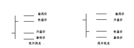
Figure 3: Bar Chart


