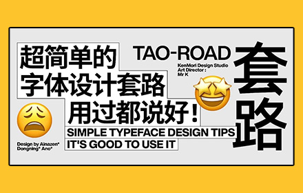
Relatively speaking, characters with serifs in strokes look more refined and detailed than those without serifs, such as the contrast between Song typeface and bold typeface. There are many types of serifs, which can be designed according to the tonality of different fonts.

The two serifs in the above figure are more suitable for some fonts with thick strokes and strong strokes.

The two serifs in the figure above are more suitable for a more elegant font.
That is, make rounded corners at the ends, intersections and corners of strokes. The rounded corners are more delicate than the right angles and have the feeling of being decorated. Of course, rounded corners are not suitable for all fonts.
When the rounded corners are large, the tonality of the text tends to be gentle and lovely.

If you want to reduce the cute feeling, try to reduce the rounded corners or make the strokes smaller.

That is, cut a short segment of a stroke where some strokes of the text cross, so that the two strokes change from cross to separate. This treatment can make the text look more breathable, and can also increase the design sense and details of the font.

This processing method is similar to the previous technique. The difference is that you don't need to cut off the strokes completely, but only open a hole. The specific shape of this hole can also be varied, which is also determined by the stroke structure of the font.

Some designers like strict alignment in typesetting and font design. Such a layout and font tend to appear too constrained and unchanged. Therefore, sometimes they deliberately make the strokes of the text misaligned, or even make the typesetting of the text misaligned, so that it will be more durable to maintain a natural feeling.

Connecting strokes is a common way of handwritten fonts, but it is also often used by designers in the font design of Song typeface and bold typeface. Some strokes in the text are partially connected, which can properly neutralize some fonts and give people a feeling of being too rigid, and also add some details to the font.

Generally, the design of non isometric font is more troublesome than that of isometric font, so many designers will habitually design fonts as isometric font, and the strokes of this type of font change relatively little. Therefore, if you change the thickness of strokes (usually curve strokes), you can also make fonts look richer.

Each of the above techniques does not have universality, but is suitable for some specific tonal font design, and often needs to be used together. Therefore, we should choose to use them according to our own actual needs. In addition, although details are important, the skeleton and shape of the font itself are beautiful, and the tonality of the font meets the design requirements. Don't put the cart before the horse.