System: windows10
Python version: python 3.6.1
Library used: matplotlib, numpy
import numpy as np
numpy.random
rand(d0, d1, ..., dn) In [2]: x=np.random.rand(2,5)
In [3]: x
Out[3]:
array([[ 0.84286554, 0.50007593, 0.66500549, 0.97387807, 0.03993009],
[ 0.46391661, 0.50717355, 0.21527461, 0.92692517, 0.2567891 ]]) randn(d0, d1, ..., Dn) The query result is standard normal distribution In [4]: x=np.random.randn(2,5)
In [5]: x
Out[5]:
array([[-0.77195196, 0.26651203, -0.35045793, -0.0210377 , 0.89749635],
[-0.20229338, 1.44852833, -0.10858996, -1.65034606, -0.39793635]]) randint(low, high,size) Generate low to high (semi open interval [low, High), size data
In [6]: x=np.random.randint(1,8,4)
In [7]: x
Out[7]: array([4, 4, 2, 7]) random_integers(low, high,size) Generate low to high (closed interval [low, High), size data
In [10]: x=np.random.random_integers(2,10,5)
In [11]: x
Out[11]: array([7, 4, 5, 4, 2])
x X axis Y y axis s Dot area c colour marker Dot shape alpha Dot Transparency #Other figures are similar to this configuration N= fifty # height=np.random.randint(150,180,20) # weight=np.random.randint(80,150,20) x=np.random.randn(N) y=np.random.randn(N) plt.scatter(x, y,s= fifty , c= 'r' , marker= 'o' , alpha= zero point five ) plt.show() 
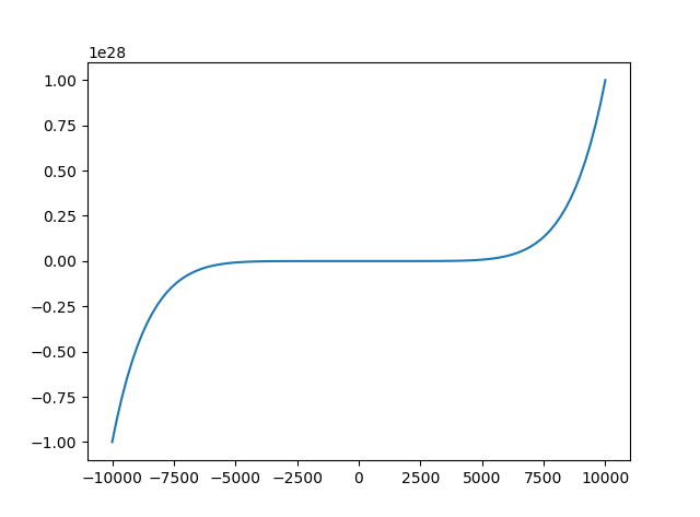
x=np.linspace( -10000 , ten thousand , one hundred ) #Divide the range from - 10 to 10 into 100 shares y=x** two +x** three +x** seven plt.plot(x, y) plt.show()
Line chart uses plot function
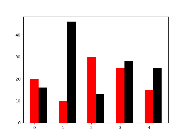
N= five y=[ twenty , ten , thirty , twenty-five , fifteen ] y1=np.random.randint( ten , fifty , five ) x=np.random.randint( ten , one thousand , N) index=np.arange(N) plt.bar(left=index, height=y,color= 'red' , width= zero point three ) plt.bar(left=index+ zero point three , height=y1,color= 'black' , width= zero point three ) plt.show()
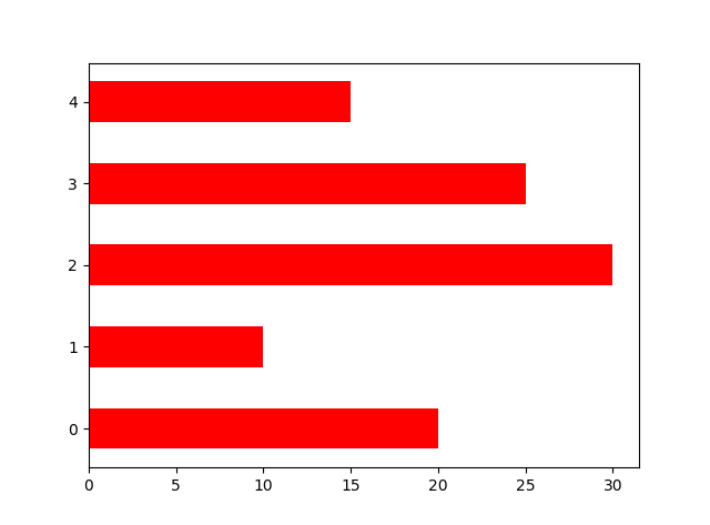
Orientation Set Horizontal Bar Chart N= five y=[ twenty , ten , thirty , twenty-five , fifteen ] y1=np.random.randint( ten , fifty , five ) x=np.random.randint( ten , one thousand , N) index=np.arange(N) # plt.bar(left=index, height=y,color='red',width=0.3) # plt.bar(left=index+0.3, height=y1,color='black',width=0.3) #Plt. barh () with h is a horizontal bar chart, and orientation is not required plt.bar(left= zero , bottom=index,width=y,color= 'red' , height= zero point five , orientation= 'horizontal' ) plt.show()
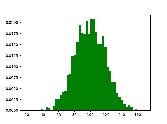
m1=100 sigma=20 x=m1+sigma*np.random.randn(2000) plt.hist(x, bins=50,color="green", normed=True) plt.show()
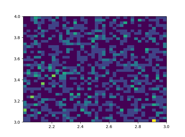
 ## Histogram of two variables
 ## The darker the color, the higher the frequency
 ## Study the joint distribution of two variables
#Bivariate histogram #The darker the color, the higher the frequency #Study the joint distribution of two variables x=np.random.rand( one thousand )+ two y=np.random.rand( one thousand )+ three plt.hist2d(x, y,bins= forty ) plt.show()
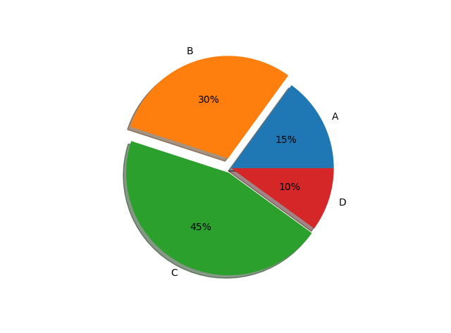
#Set x, The y-axis scale is 1:1, so as to achieve a positive circle #Labels label parameter, X is the corresponding data list, Autopct displays the proportion of each area, Explode highlights a block, Shadow labes=[ 'A' , 'B' , 'C' , 'D' ] fracs=[ fifteen , thirty , forty-five , ten ] explode=[ zero , zero point one , zero point zero five , zero ] #Set x, The y-axis scale is 1:1, so as to achieve a positive circle plt.axes(aspect= one ) #Labels label parameter, X is the corresponding data list, Autopct displays the proportion of each area, Explode highlights a block, Shadow plt.pie(x=fracs, labels=labes,autopct= "%.0f%%" , explode=explode,shadow= True ) plt.show()
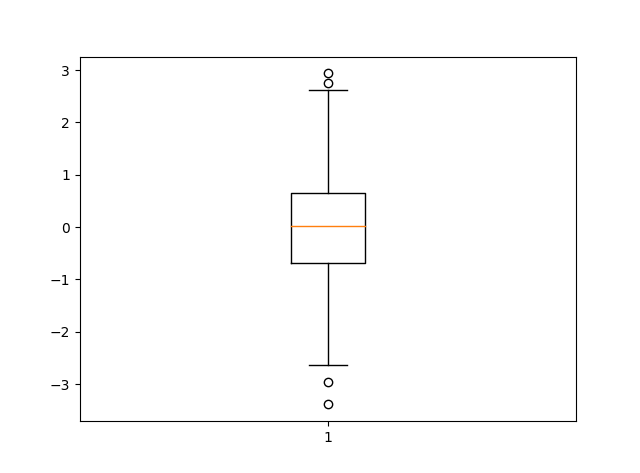
 import matplotlib.pyplot as plt import numpy as np data =np.random.normal( loc = zero , scale = one , size = one thousand )
 #The shape of sym point, The length of the dotted line
 plt .boxplot( data , sym= "o" , whis= one point five )
 plt .show()
#The shape of sym point, The length of the dotted line
Github address: https://github.com/nanxung/python-.git
Code cloud address: https://git.oschina.net/nanxun/pythonshujukeshihuajiantu.git Source: https://my.oschina.net/u/3264690/blog/915068