• Welcome to Baben's blog that year. I'm glad to meet you at the right age!
  • Due to the theme, the QQ login partner displays the default avatar in the comments. Please go to the personal center to upload the avatar again.

Adaptive adaptation of vue mobile terminal

Code Notes barben 4 years ago (March 12, 2020) 3234 views 0 comments

This is the first article in the Year of the Rat!
It is also the first task to complete the development of the WeChat public account mobile terminal project after the forced holiday when we just started working remotely!
Without much talk, vue goes!

1、 Installing the lib flexible plug-in

lib-flexible 】Mobile end elastic layout adaptation solution. Used to set the benchmark value of rem. The plug-in will automatically set the font size of the html root element, which is set to one tenth of the screen width by default.
For example, if the current screen width is 1920px, it will automatically add font size: 192px style to the html tag. At this time, 1 rem is equal to 192 px.
1. Installation:

 npm i -S amfe-flexible

2. Add the mobile terminal adapted meta code (the project built by vue-cli3, the file is in the public directory) at the head of index.html:

 <meta name="viewport" content="width=device-width, initial-scale=1, maximum-scale=1, minimum-scale=1, user-scalable=no">

3. Introduction, choose one of the following methods:

 //Directly import it in the main.js file (the file is in the src directory) import 'amfe-flexible/index.js'; //Or add this tag in the index.html file <script src="./node_modules/amfe-flexible/index.js"></script>

2、 Install the postcss pxtorem plug-in

postcss-pxtorem 】A postcss plug-in. It is used to convert the unit into rem. The px unit written in the code will be automatically converted into rem and displayed on the browser by dividing the px size by the benchmark value according to the set benchmark value.
For example, if the benchmark value is 75 (one rem equals to 75px) and the element width is set to 750px, the plug-in will automatically convert the element width to 10rem.
1. Installation:

 npm install postcss-pxtorem --save-dev

2. (Applicable to vue-cli3) Find vue.config.js in the root directory and write the following code. If there is no such file, please create it yourself:

 module.exports = { css: { loaderOptions: { postcss: { plugins: [ Require ('postcss-pxtorem ') ({//Convert px units to rem units RootValue: 75,//The converted base (divide the design draft with a width of 750px into 10 equal parts, each of which is 75px, that is, 1rem=75px) propList: ['*'], // selectorBlackList: [ //     "van-", //     "weui" // ], //Styles starting with "van -" and "weui" do not automatically perform rem conversion }) ] } } } };
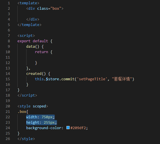
After executing the above operations, you can fill px without hesitation. They will be automatically converted to rem units when compiling!!!

The key point is here, circle it and take the exam!

Which of the following pages do you think is better?

Figure 2 must be the first choice!
So in order to make the page friendly on the PC side,
You should set a maximum width for the page!

 //Write in main.js //REM adaptation: set the size of font size in HTML function setRem () { let htmlWidth = document.documentElement.clientWidth || document.body.clientWidth; let htmlDom = document.getElementsByTagName('html')[0]; htmlDom.style.fontSize = (htmlWidth / 10) > 75 ?  "75px" : htmlWidth / 10 + 'px'; //  Set the maximum 1rem not to exceed 75px // htmlDom.style.fontSize = htmlWidth / 10 + 'px'; //  Previously, 1 rem was equal to screen width divided by 10 } setRem(); //  initialization window.onresize = function () { setRem(); }
 /*Set the style for the largest parent container, which may be # app in the App.vue file*/ #app { max-width: 750px; /*  The plug-in will automatically parse into 10rem*/ margin: 0 auto; }

Eight blogs that year, we have been
If the author does not indicate that it is an original article, please indicate the link and source of this article for reprinting
Adaptive adaptation of vue mobile terminal- https://www.barben.cn/code/677.html
Like( eight )
Post my comments
Cancel comment
expression Mapping Bold Strike through Center Italic

You need to bring your nickname and email with you in the review of Eight Books that year!

  • Nickname (required)
  • Email (required)
  • website