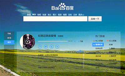
Today, Baidu's personality homepage has been revised again. This time, the online website has a little personality: overall, it feels really good, but it's always a little uncomfortable. I'm not satisfied that the transparency of the middle part of Baidu is 20% of the starting point. Some words are really hard to see clearly, or it's uncomfortable to see. I suggest changing the transparency to the previous one, which is better than the navigation, news and music on the left. Hehe. This is just my wishful thinking, I feel my tone is different, hehe