Last updated on July 25, 2018
If you are a web designer and often use WordPress, you may like this case study. I will show you the process of designing WordPress theme. Enjoy!
A few months ago, at the invitation of Slocum Themes, I accepted a challenge to design a wordpress theme for bloggers. The idea is to use all the default functions of wordpress to create a simple and effective theme.
I decided to take inspiration from social media. After all, an upgraded version of social media can be considered a microblog. I have done some research on how social media platforms such as Facebook, Twitter, Google+and pinterest display articles, especially articles with photos. Then Socialize was born.
design process
The first step is always to draw a wireframe on paper, then design it in Photoshop, and then code it. Since it is a wordpress theme, I can list all the components and elements of the website, so I decided to follow the basic Wordpress blog Style (header, main body, sidebar, footer), no need to draw too many wireframes.
On the contrary, I want to create a set of style guides, so I break everything down, design one component at a time, and keep the overall design unified. I only combine all the components after they are completed, instead of using the conventional method, first design the home page and then the inside page. I want to create a set of reliable guides that can be used on all pages.

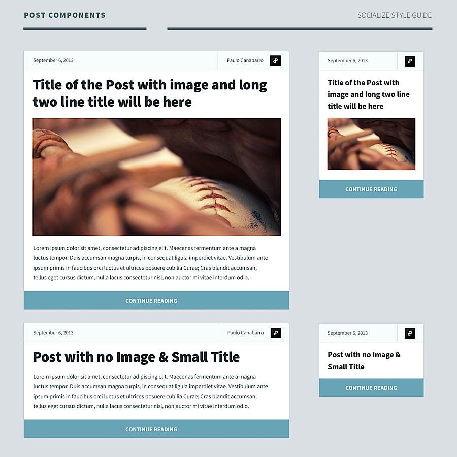
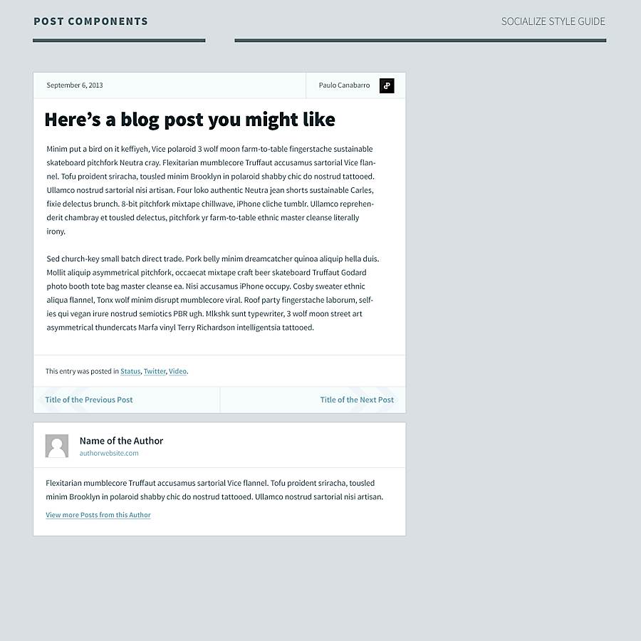
Article Component
With this in mind, I think my focus should be on the most important element of blog - "article component", how it should be displayed on the home page to attract users to read in depth. So this is the starting point of everything. I decompose the article components into more subtle elements, such as:
- Article Date
- Author
- Article Title
- Post Thumbnails
- Article description
- Action Item
I decided to ignore some other common elements, such as categories, tags, and comments.
After several drafts, I have a fixed concept of what I want to design. I'm not reinventing the wheel, but trying to simplify it. Today, most blog topics have a surprising number of options. My idea is to keep it simple and effective on desktop and mobile devices.
As the first and most important component is completed, I list all other components and elements that need to be designed.
- colour
- typeface
- grid
- picture
- Navigation and buttons
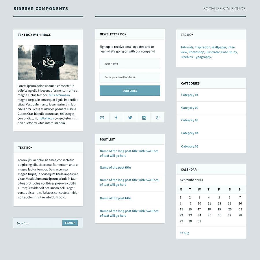
- sidebar
- Footer
- Page turning of articles
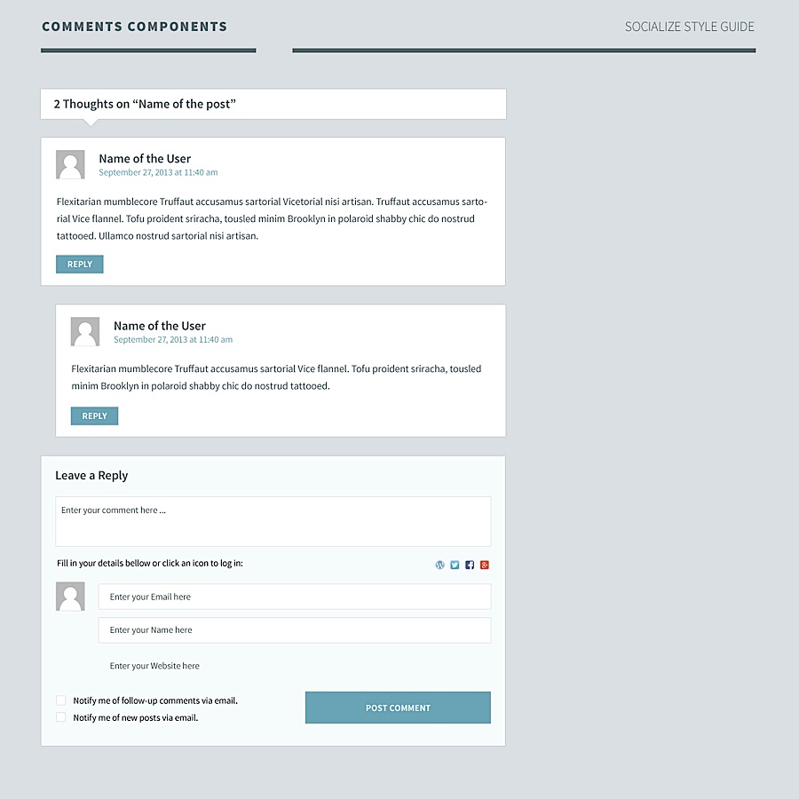
- Article comments
colour
Because the theme will have various color schemes, how many colors are used and where they are used is very important. I decompose it in this way:
- Primary color
- Secondary color
- Background color
- Text Color
- Link Color
- link
- Mouse over status
- Mouse click status
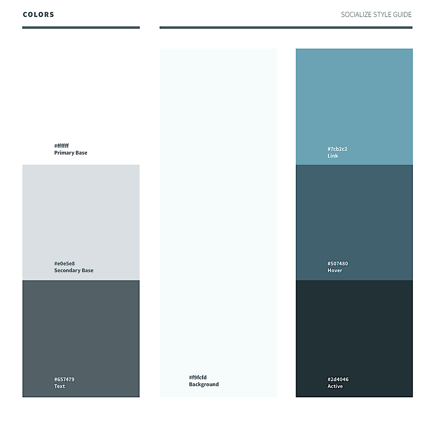
Once the color guide is created, you can use Adobe Photoshop to easily change it to another set of colors, reduce the saturation to black and white, and then cover a layer of the selected color.
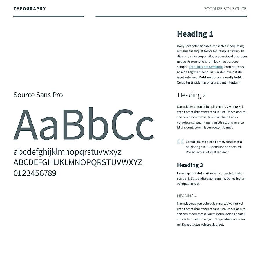
typeface
The next step is to define a set of font structure benchmarks to guide the articles on the home page and inside page. In this project, the font I selected is Source Sans Pro, a sans serif font produced by Adobe, which performs well in the user interface. Although I created a set of simple guides in Photoshop, I still need to code a complete set for reference (see the font guide).
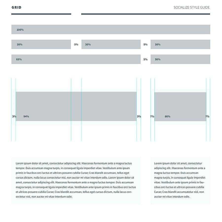
grid
I have created a grid system that is very effective for blogs with sidebars. Streaming layout is completely responsive, and supports 1200 pixels wide at most
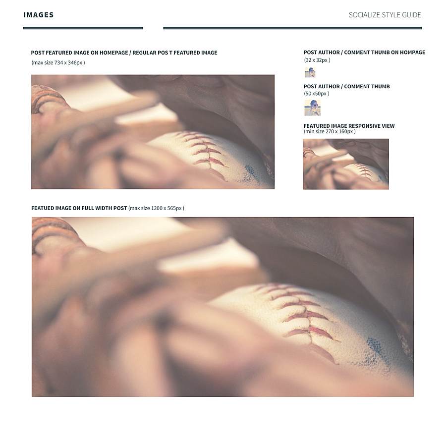
picture
Although the theme is responsive and the size of some pictures will change according to the screen size, I still want to set the maximum and minimum sizes according to the grid.
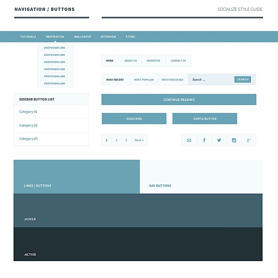
Navigation and buttons
The navigation is very simple, and the color effect is determined by the color I choose, in order to maintain the consistency of the whole theme.
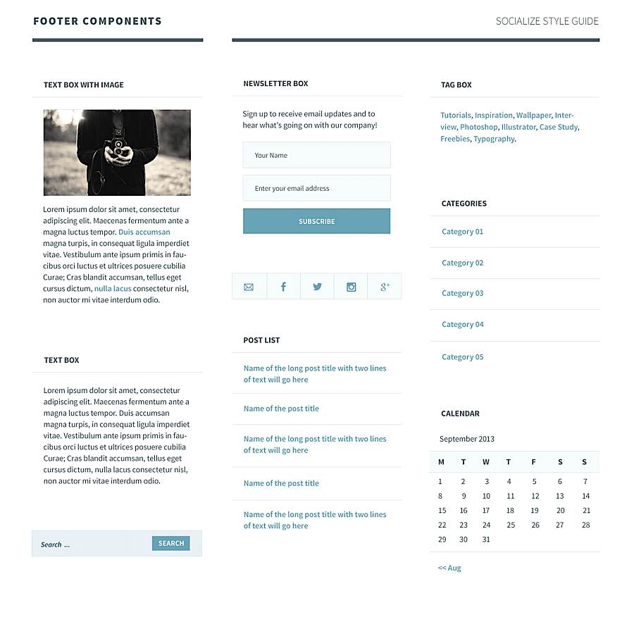
Sidebar and footer
The footer and sidebar use the same components, so I designed them as one. The only difference is that the background color of the footer makes its components slightly different.
Articles and comments component
To complete all the components in my style guide, I still need the article and article comment components.
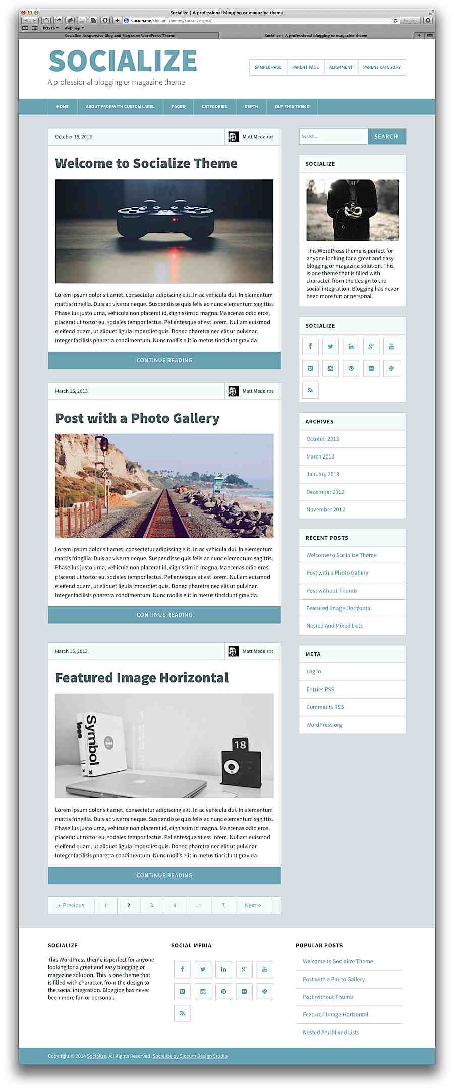
Final design
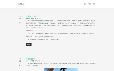
Once my style guide is completed, I just need to piece everything together. I wrote HTML and CSS and handed it to my friends in Slocum Studio to process it into Wordpress Theme 。 Some elements have slightly changed during coding.
This is the final home page. This set of themes is completely responsive and features 8 different colors.