Software Introduction
-
Automatic conversion of chart style: after using Excel to draw a chart, select the chart styles such as "R ggplot2", "Python Seaborn", "Matlab 2013", "Matlab 2014", and "Excel Simple" in the "Background Style" to automatically set and convert the chart background style; -
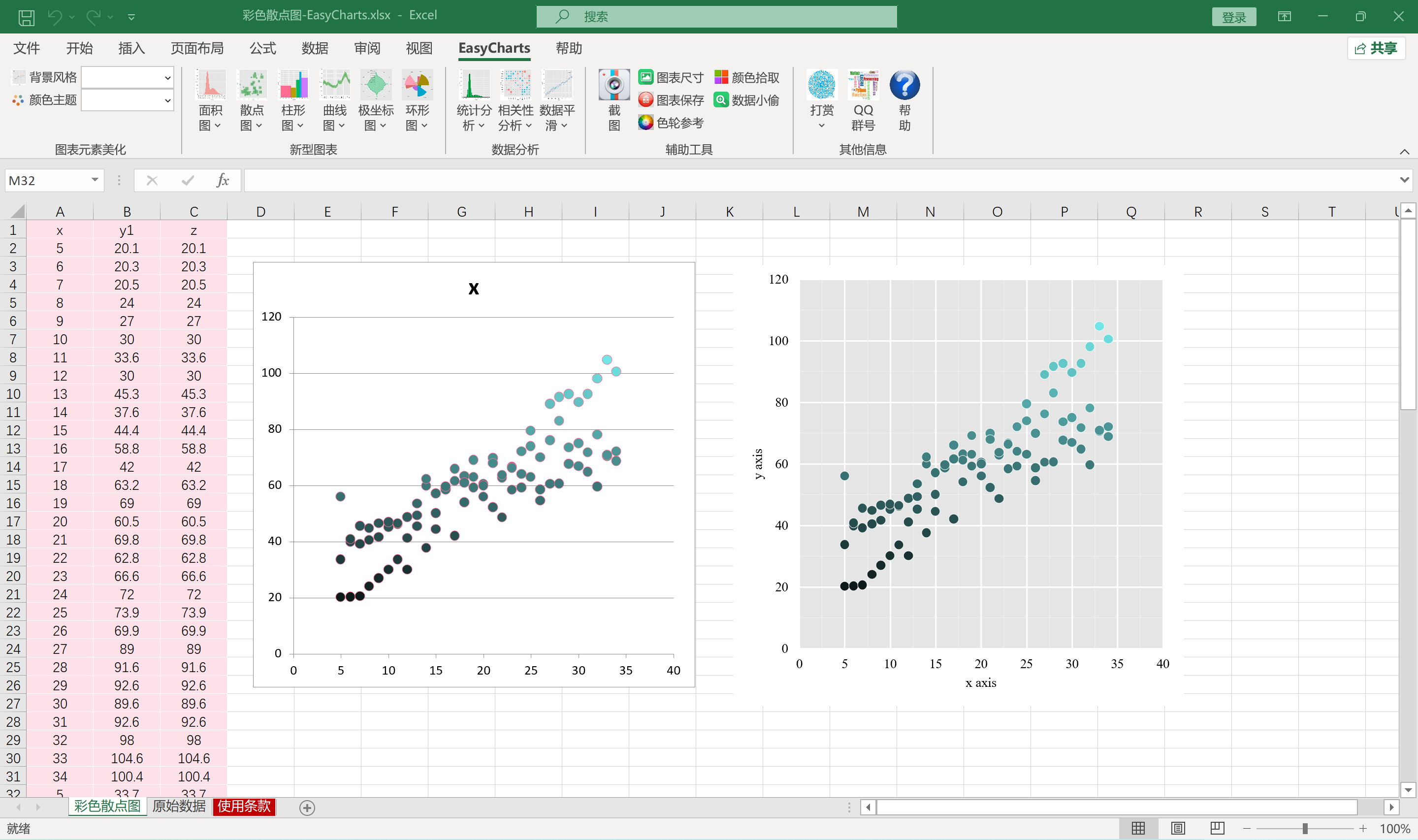
Automatic conversion of color theme: after drawing a chart with Excel, select the items "R ggplot2 Set1", "R ggplot2 Set2", "R ggplot2 Set3", "Tableau 10 Medium", "Tableau 10", "Python seaborn hsul", "Python seaborn default" and other color themes in "Color Theme" to realize automatic conversion of color themes; -
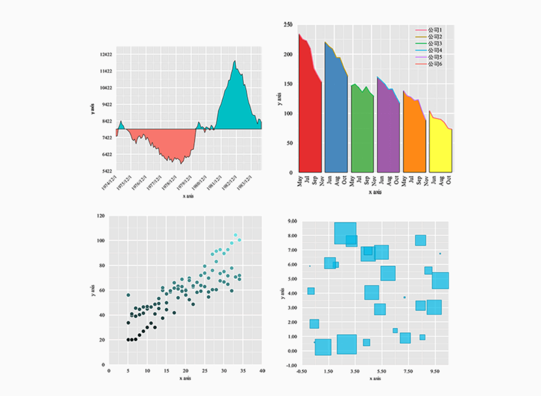
Automatic drawing of new charts: charts that used to be drawn by adding auxiliary data can now be automatically drawn by selecting the original data with the help of plug-ins. New charts include smooth area charts, Nightingale rose charts, mosaic charts, bullet charts and other charts, some of which are shown in Figure 2; -
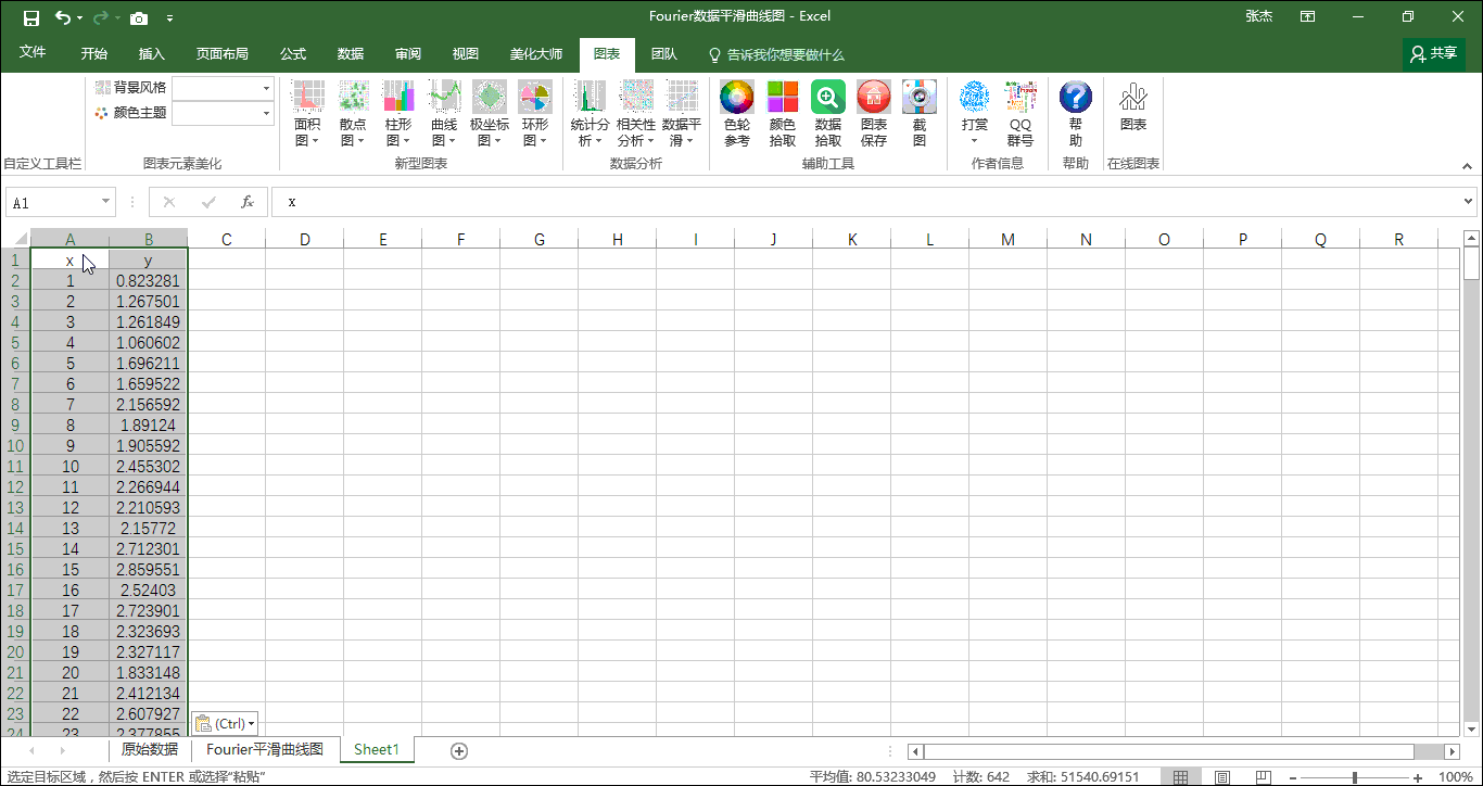
Automatic realization of data analysis: use "data analysis" to realize the automatic drawing of frequency histogram, kernel density estimation chart, correlation coefficient matrix chart, Loess data smoothing, Fourier data smoothing and other data analysis and charts; -
Use of Excel auxiliary tools: "auxiliary tools" include color picking, data thief, color wheel reference, chart saving, screenshots and other functions. In particular, "data thief" can read and obtain the original data of charts and tables by automatically or manually reading the existing column chart or curve chart.
Download address


![Wancai Animation Master | 0 Basic Animation Video [Software Recommendation] - Wood of Falling Dust](https://img.luochenzhimu.com/public/2024/05/2024051509.png)


![Official Windows 11 Release [Official MVS (MSDN)] [Windows 11 NI-23H2] February 2024 Image Update - Wood of Dust](https://img.luochenzhimu.com/public/2021/10/2021100515.jpg)