The effect of dividing buttons is a very popular arrangement, especially practical on mobile terminals. The width of the entire button group is 100% of the container, and each button in the button group is divided into the entire container width. For example, if there are five buttons in your button group, each button is 20% wide. If there are four buttons, each button is 25% wide, and so on.
Equalization button is also called adaptive grouping button, and its implementation method is also very simple. You only need to add one to the button group "btn group"“ btn-group-justified ”Class name, as follows:
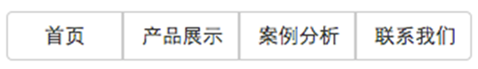
<div class="btn-wrap"> <div class="btn-group btn-group-justified"> <a class="btnbtn default" href="#">Home Page</a> <a class="btnbtn default" href="#">Product Presentation</a> <a class="btnbtn default" href="#">Case Study</a> <a class="btnbtn default" href="#">Contact us</a> </div> </div>
In this way, whether there are four words or two three words in the content, it will be displayed in the center, as shown in the figure:
The implementation principle is very simple. "btn group justified" is simulated as a table (display: table), and the buttons inside are simulated as table cells (display: table cell). The specific style code is as follows:
.btn-group-justified { display: table; width: 100%; table-layout: fixed; border-collapse: separate; } .btn-group-justified > .btn, .btn-group-justified > .btn-group { display: table-cell; float: none; width: 1%; } .btn-group-justified > .btn-group .btn { width: 100%; }
Ps: When making split button groups, try to use<a>label elements to make buttons, because using display: table in some browsers is unfriendly when using<button>label elements.