home page / Material code

The most comprehensive responsive slide jQuery plug-in: slice

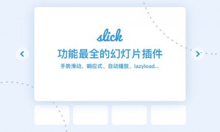
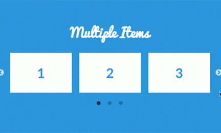
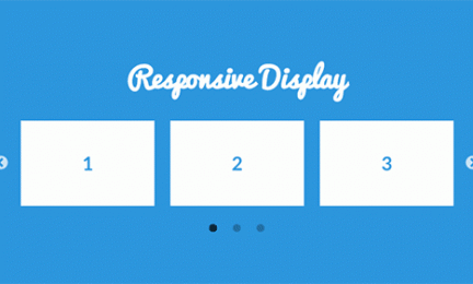
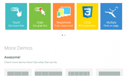
When the designer saw the introduction of this slide, it was very good. Please share it. With the popularity of mobile terminals, in order to make it convenient for visitors to view web content, the web slide effect (also known as: light box, rotation chart) also needs to support mobile terminals, that is, responsive, of course, with drag and drop support, it would be better to share a practical

OkayNav: automatically hide the responsive menu of redundant menus according to the browser width

Responsiveness is undoubtedly the mainstream web design nowadays. In the process of making themes, Advocate has not had a good way to deal with the responsiveness of horizontal menus. After all, we cannot know how long the user's horizontal menus will be. We can only display them in separate lines. In fact, the best effect is to automatically hide the redundant menus according to the browser width. Advocate

BLazy.js: lightweight lazyLoad script that supports responsive images

BLazy is a lazyLoad script that does not rely on a third-party JS library (such as jQuery). The compressed version is only a few kilobytes, and it supports displaying pictures of different sizes according to different device widths. This function is very useful for responsive development, and is also the main reason for the recommendation. Fortunately, such a good

© 2009-2020 CMHELLO. COM · WordPress based
Return top