Excel is an indispensable and important software for everyone's daily work. It is convenient for us to improve our work efficiency, and can be used anywhere, so it is widely used.However, of course, there are many operation steps of excel, so sometimes people don't understand how to operate. Let's talk about how to make an excel histogram.
What's the use of excel histogram
In fact, this chart is to let us understand the changes of data more intuitively. We can directly know the trend of data, and it is also a very important part of Excel. After all, Excel is mainly used to make tables of data, so data sorting is very important.
How to make excel visual chart
1. Let's open a form
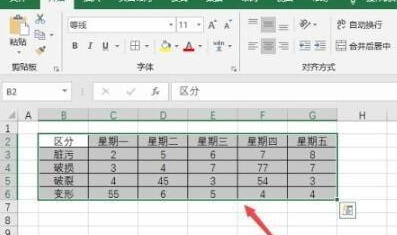
2. Select the following areas from the digital documents we have prepared
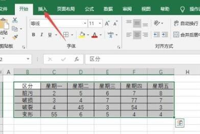
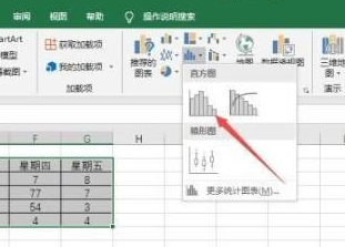
3. Then click Insert in the toolbar, and a statistical chart will appear below
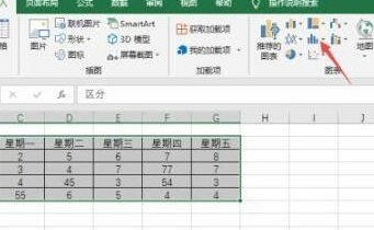
4. A prompt will appear, and then a histogram will emerge
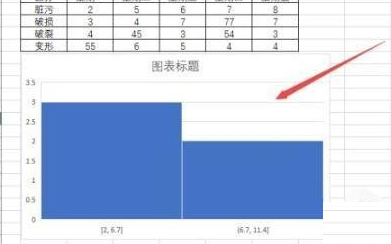
5. Click the histogram to generate a histogram.
Is it very simple? If you need it, you can refer to it and start to operate it. It won't be very complicated.
This article is written byweiweiPublished on March 6, 202315:41:53
This article is collected and sorted by the website of Mutual Benefit, and the email address for problem feedback is:wosnnet@foxmail.com, please keep the link of this article for reprinting:https://wosn.net/14288.html