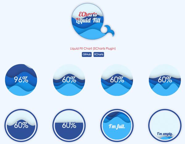
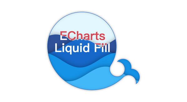
The water globe chart is a chart type suitable for displaying single percentage data. ECharts Water polo diagram plug-in It enables you to achieve cool data display effect through very simple configuration.
So, today we will learn how to use ECharts water globe chart.
Step 1: Import JavaScript files
ECharts' water globe diagram is a plug-in unit Type of chart. This means that the complete version downloaded from ECharts' official website will not include the water polo diagram - this ensures that users who do not need to use the diagram can obtain a code version as small as possible. When using, you need to import the echarts.js and the corresponding echarts-liquidfill.js of the water globe diagram GitHub Find the latest version.
<script src="echarts.js"></script> <script src="echarts-liquidfill.js"></script> <script> //Code for using the water globe diagram </script>
Step 2: Specify the DOM element as the chart container
Like other ECharts charts, we need to specify an element with height and width in the DOM as the chart container -- that is, the location where the chart will be drawn.
<div id="liquidfill-chart" style="width=100%; height = 400px"></div>
Pass in this DOM element, and use ECharts to initialize the chart:
var chart = echarts.init(document.getElementById('liquidfill-chart'));
Step 3: Set the parameters of the water globe chart
Like other ECharts charts, the water globe chart provides a way to specify the series type as' liquidFill '(pay attention to case) to indicate that this is a water globe chart type.
A simple configuration item can be:
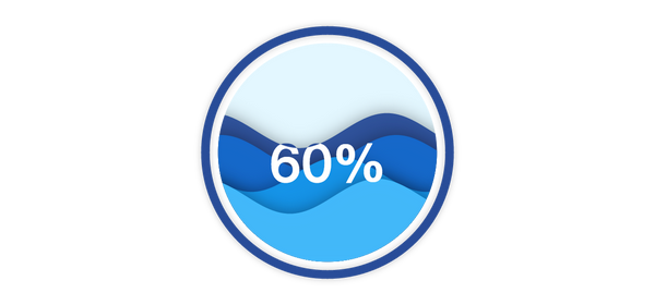
var option = { series: [{ type: 'liquidFill', data: [0.6, 0.5, 0.4, 0.3] }] }; chart.setOption(option);
In this way, you can get the effect of water polo:
If the chart is not displayed correctly, you can check the following possibilities:
- Whether the JS file is loaded correctly;
- Whether the echarts variable exists;
- Whether the console reports an error (if the error shows that the liquidFill series does not exist, it is likely that the echarts-liquidfill.js is not loaded correctly);
- Whether the DOM element has height and width when it is in echarts.init.
It can be found that in the above code, we only specified the chart type as' liquidFill 'and set the data as [0.6, 0.5, 0.4, 0.3] (corresponding to the four generated waves), while other parameters are preset.
Even if you don't configure many parameters, the preset parameters can also make you get an elegant water polo effect. If there are specific requirements, ECharts water polo map supports highly customized effects. Let's explain how to customize your water polo map.
Step 4: Customizing the Water Ball Diagram
The water globe diagram supports highly customized requirements, including color, radius, amplitude, wavelength, phase, period, direction, shape, and animation. For complete configuration item parameters, see Water Ball Diagram API . The document has a detailed description of each configuration item. Here we will introduce some important parameters.
Shape and Animation
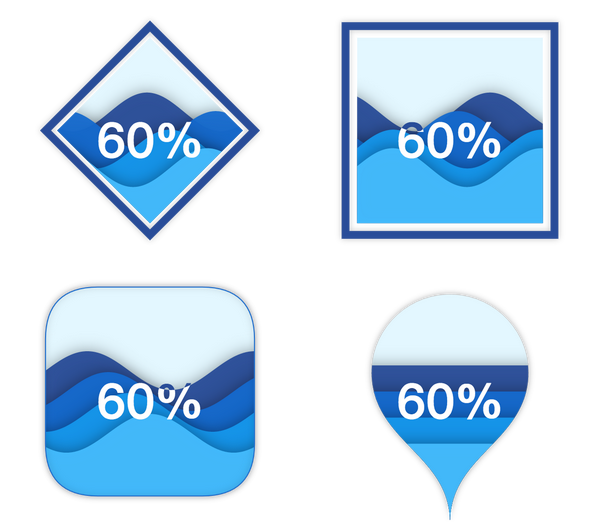
In addition to the default round ('circle ') water globe diagram, you can also set shape to ECharts Symbol Other types of: 'rect', 'roundRect', 'triangle', 'diamond', 'pin', 'arrow'. Even, use ' path://... 'in the form of Specify an SVG path , get a very cool effect:
Specify the moving direction of the wave by setting the direction to 'left' or 'right', or set it to 'none' to indicate static.
The complete configuration item code of the above example is:
// run at: http://gallery.echartsjs.com/editor.html?c=xry0tUfcBe var option = { series: [{ type: 'liquidFill', data: [0.6, 0.5, 0.4, 0.3], radius: '40%', shape: 'diamond', center: ['25%', '25%'] }, { type: 'liquidFill', data: [0.6, 0.5, 0.4, 0.3], direction: 'left', radius: '40%', shape: 'rect', center: ['75%', '25%'] }, { type: 'liquidFill', data: [0.6, 0.5, 0.4, 0.3], radius: '40%', shape: 'roundRect', center: ['25%', '75%'], backgroundStyle: { borderColor: '#156ACF', borderWidth: 1, shadowColor: 'rgba(0, 0, 0, 0.4)', shadowBlur: 20 }, outline: { show: false }, waveAnimation: false, //No left and right fluctuations }, { type: 'liquidFill', data: [0.6, 0.5, 0.4, 0.3], radius: '50%', shape: 'pin', center: ['75%', '75%'], amplitude: 0, waveAnimation: false, outline: { show: false }, backgroundStyle: { shadowColor: 'rgba(0, 0, 0, 0.4)', shadowBlur: 20 }, }] };
Configuration of single wave
In addition to the settings for all water waves, each water wave can be configured separately. Like other ECharts configuration items, configuration items for a single data will cover the entire series of configuration items.
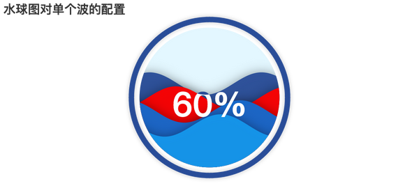
In this example, we set the second water wave to red and change its moving direction.
var option = { series: [{ type: 'liquidFill', data: [0.6, { value: 0.5, direction: 'left', itemStyle: { normal: { color: 'red' } } }, 0.4, 0.3] }] };
It can be found that one item in the original data is a number, but in the data that needs special customization, we set it as an object, the value is the original number, and other configuration items will overwrite the values of the series configuration items.
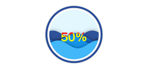
Text display
The text in the middle of the water globe has a cool effect. The color of the text in front of the water wave and the background is different. You can set the text color at the water wave through insideColor, and the text color at the background through color.
var option = { series: [{ type: 'liquidFill', radius: '80%', data: [0.5, 0.45, 0.4, 0.3], label: { normal: { textStyle: { color: 'red', insideColor: 'yellow', fontSize: 50 } } } }] };
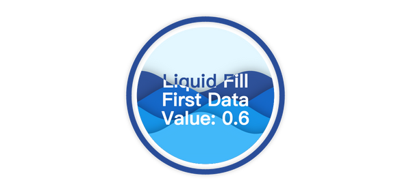
The percentage data is displayed in the middle of the chart by default. If you need to set it to other text content, you can specify it through the formatter, which is the same as other ECharts formatting functions.
Formatter can be a string, in which '{a}', '{b}' and '{c}' will be replaced with series name, data name and data value respectively.
For example:
var option = { series: [{ type: 'liquidFill', name: 'Liquid Fill', data: [{ name: 'First Data', value: 0.6 }, 0.5, 0.4, 0.3], label: { normal: { formatter: '{a}\n{b}\nValue: {c}', textStyle: { fontSize: 28 } } } }] };
In addition, formatter can also be a function. The following code can get the same effect as the string form above.
formatter: function(param) { return param.seriesName + '\n' + param.name + '\n' + 'Value:' + param.value; }
Summary
Above all, we have introduced some basic uses of ECharts' water globe diagram, hoping to inspire you and create more turbulent works.
For more complete configuration items, please refer to GitHub Detailed documentation , or check others on ECharts Gallery Water polo works 。