How to make logarithmic chart with excel

Latest answers Change
Q: Why put ginger in preserved egg salad
Can Anmuxi drink hot 2020-01-08
How to raise money easily 2019-08-09
What kind of animal is rich 2020-02-27
The knitting of pearl and rice bead ring 2020-08-06
Related recommendations

What is oxfan10

How to synchronize software on Apple mobile phones

Is the consumptive fish seafood

What does a wolf in sheep's clothing express

How to make individual income tax accounting entries

Does single electric energy replace the SLR

What are the anchor's speaking skills

What should be checked first and then with the "sense" radical method

Must Netease Cloud musician certification be over 18 years old

How to set the bios after entering
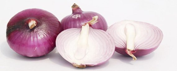
Can I eat frozen onions

What does a famous saying mean

Can I wipe body lotion without taking a bath