Full guide to Android screen adaptation (I) - master screen units and deal with ever-changing devices


This article starts from the common length units px Dp and sp are introduced in detail.

Then it discusses screen size, resolution, pixel density and other important screen indicators in depth to help readers fully understand the relationship between them. Finally, the example code demonstrates how to convert units in the code, laying the foundation for the perfect adaptation of various device screens.

Through the study of this article, I believe that readers will be able to master various skills of Android multi screen adaptation, and create a truly "catch all" application.


1、 Length unit


1、 Px pixel

 Insert picture description here


Px is the abbreviation of Pixel, which is the smallest display unit on the screen, usually representing a point or an image unit. In digital image processing and Web development, Px is the most commonly used unit of length. However, in mobile development, we should give priority to using relative units to ensure that content can be displayed correctly on different devices.


  • definition

    • Px is a unit of relative length, which represents the physical pixels on a display device.
    • Each px corresponds to a small square on the screen, which together form the image we see.

  • characteristic

    • Px is an absolute unit and does not change with screen resolution or scaling.
    • The px size of different devices may be different because their physical pixel density (DPI) is different.

  • In development, Px is often used to set the size, location and other attributes of elements.

  • On different devices, the same px value may render different actual sizes, because the device DPI is different.

2. Scaled pixels - sp


(1) What is sp?

  • Sp (scale independent pixels) is a relative length unit, mainly used to set font size.

  • Similar to dp, it also scales according to the user's font size settings.

  • Normally, The conversion ratio of sp and dp is 1:1, but if the user changes the system font size setting, The sp will change accordingly, while the dp will not.


(2) Why use sp?

  • Compared with px, Sp can ensure that the size of text displayed on different devices is consistent.

  • This is because sp will scale according to the user's font size settings, while px will not.

  • For example, even on devices with different resolutions or densities, the font size set with sp will look the same.


(3) How to use sp?

  • In XML layout files, you can use sp units to set the size of text:

     < TextView
         android: layout_width = " wrap_content "
         android: layout_height = " wrap_content "
         android: textSize = " 16sp "  />
    

(4)、 Difference between sp and dp

  • Dp is a relative length unit independent of screen density, while sp is a relative length unit independent of user font size settings.
  • In most cases, The conversion ratio of sp and dp is 1:1, but if the user changes the system font size setting, The sp will change accordingly, while the dp will not.
  • Therefore, for setting the text size, we should give priority to using sp instead of px or dp to ensure that the size of text displayed on different devices is consistent.

3. Device independent pixels - dip/dp


(1) What is dp/dip?

  • Dp (identity dependent pixels) and dip (device dependent pixels) are the same concept, which refers to a relative length unit.

  • It is independent of the screen density of the device, which can ensure that under different resolutions and screen densities, The physical dimensions of UI elements are consistent.

  • 1 dp equals 1/160 inch, which means that on a 160 dpi screen, 1 dp equals 1 px.


(2) Why use dp/dip?

  • On different devices, the same px value may render different actual sizes, because the device DPI is different.

  • Using dp/dip can solve this problem, because it will automatically scale according to the screen density of the device to ensure that the UI elements maintain the same physical size on different devices.

  • This is very important for developers, because it can ensure that applications can be displayed and run normally on various devices.


(3) How to use dp/dip?

  • In the XML layout file, you can use dp units to set the size of UI elements:

     < TextView
         android: layout_width = " 200dp "
         android: layout_height = " 50dp "
         android: textSize = " 16sp "  />
    

4、 Cm cm&inch inch


 Insert picture description here


 Insert picture description here


Centimeter and inch are two commonly used length units. In daily life and application development, unit conversion is often required.


Conversion relationship between centimeter (cm) and inch (inch)

  • 1 inch=2.54 cm
  • 1 cm=0.393701 inch

This is a standard conversion relationship and will not change.

It is based on the conversion standard between the International System of Units (SI) and English units.

 public class UnitConverter { public static double cmToInch(double cm) { return cm * 0.393701; } public static double inchToCm(double inch) { return inch * 2.54; } } //Example of use double centimeters = 10.0; double inches = UnitConverter.cmToInch(centimeters); System.out.println(centimeters + " cm = " + inches + " inches"); double inchesValue = 5.0; double centimetersValue = UnitConverter.inchToCm(inchesValue); System.out.println(inchesValue + " inches = " + centimetersValue + " cm");

Output results:

 10.0 cm = 3.93701 inches 5.0 inches = 12.7 cm

5、 Pt points

Standard length unit, 1pt=1/72 inch, used in printing industry, very simple and easy to use


2、 Screen unit


1. Screen size


(1) Screen size refers to physical size (e.g. mobile phone screen, computer screen LED screens are real size)

(2) Screen size refers to the length of the diagonal line of the screen

(3) The screen size is in inch, and one inch is about 2.54cm


The common mobile phone screen sizes are 4.7 ", 5.0", 5.5 ", 6.0", etc.

 Insert picture description here


There are several common ways to obtain screen size in Android:

(1) , use DisplayMetrics class

 DisplayMetrics displayMetrics =  new  DisplayMetrics ( ) ;
 getWindowManager ( ) . getDefaultDisplay ( ) . getMetrics ( displayMetrics ) ;
 int width = displayMetrics . widthPixels ;
 int height = displayMetrics . heightPixels ;

(2) . Using the WindowManager class

 WindowManager windowManager =  ( WindowManager )  getSystemService ( Context . WINDOW_SERVICE ) ;
 Display display = windowManager . getDefaultDisplay ( ) ;
 Point size =  new  Point ( ) ; display . getSize ( size ) ;
 int width = size . x ;
 int height = size . y ;

(3) . Use the Resources class

 Resources resources =  getResources ( ) ;
 DisplayMetrics metrics = resources . getDisplayMetrics ( ) ;
 int width = metrics . widthPixels ;
 int height = metrics . heightPixels ;

(4) . Use Configuration class

 Configuration configuration =  getResources ( ) . getConfiguration ( ) ;
 int widthDp = configuration . screenWidthDp ;
 int heightDp = configuration . screenHeightDp ;

2. Image resolution

Resolution, which can be classified from screen resolution and image resolution.


(1) , screen resolution

Resolution in Android devices refers to the screen resolution, that is, the number of pixels that can be displayed on the screen, which determines the display quality of the screen. The higher the resolution, the richer the details that can be displayed, and the clearer the image will be. Common resolutions are:

  • Standard definition (SD) resolution: 640x480
  • High definition (HD) resolution: 1280x720
  • Full HD resolution: 1920x1080
  • 2K resolution: 2048x1080
  • 4K resolution: 3840x2160

(2) Image resolution

Image resolution reflects the degree of detail and expressiveness of an image, and is an important indicator to describe image quality. It is mainly reflected in the following aspects:

  • Number of pixels

    • Image resolution refers to the number of pixels contained in the image, usually expressed in the form of width x height, such as 1920x1080, 3840x2160, etc.
    • The more pixels, the richer the details of the image and the clearer the picture.
  • Pixel density

    • Pixel density, also known as PPI (Pixels Per Inch) or DPI (Dots Per Inch), represents the number of pixels per inch.
    • The higher the pixel density, the clearer and more delicate the image looks under the same physical size.
  • Color depth

    • Color depth describes the number of colors that can be represented by each pixel in the image.

    • The higher the color depth, the stronger the color expression of the image. Common color depths are 8 bits (256 colors), 16 bits (65536 colors), 24 bits (16.7 million colors), etc.


3. Screen density or pixel density (Dots Per Inch DPI)


DPI is a unit representing image resolution, which describes the number of pixels or points contained in each inch of image. let me put it another way, The higher the DPI value, the higher the detail and clarity of the image.


(1)、 Importance of DPI

It is mainly reflected in the following aspects:

  • Display quality

    • A high DPI value means that the details displayed are richer and clearer in the same physical space.
    • Under the same physical size, the high DPI display screen can provide better display effect.
  • Print quality

    • The details and sharpness of the printed output are closely related to the DPI value.
    • Generally, the higher the DPI value of the printer, the clearer the printed image.
  • Image quality

    • The DPI value of digital image determines the final resolution and detail performance of the image.
    • At the same physical size, Images with high DPI values can provide better display and printing effects.

(2) Common DPI values

  • 72 DPI: default DPI value of Windows operating system, used for screen display.
  • 96 DPI: the default DPI value of Windows XP and later versions, used for screen display.
  • 150-300 DPI: The DPI value range of general printouts can provide high print quality.
  • 300-600 DPI: The DPI value range of high-quality printouts can achieve very clear results.
  • 1200-2400 DPI: DPI value range of industrial grade printer, used for high-precision commercial printing.

For example, the printer's 600 DPI resolution means that the printer can output 600 x 600=360000 output points per square inch.


4. Image sampling rate (PPI)


(1)、 What is PPI?


Pixels Per Inch, PPI) refers to the number of pixels per inch of the screen. Generally speaking, it refers to the number of pixels per inch of the screen.

 Insert picture description here


It is a very important display technical indicator, which can reflect the clarity and delicacy of the screen, The higher the PPI, the more detailed and clear the content displayed on the screen.


(2)、 PPI calculation formula


PPI=√ (width pixels ^ 2+height pixels ^ 2)/diagonal inches

 Please add a picture description


The above formula is about resolution PPI、 The relationship between the three dimensions.

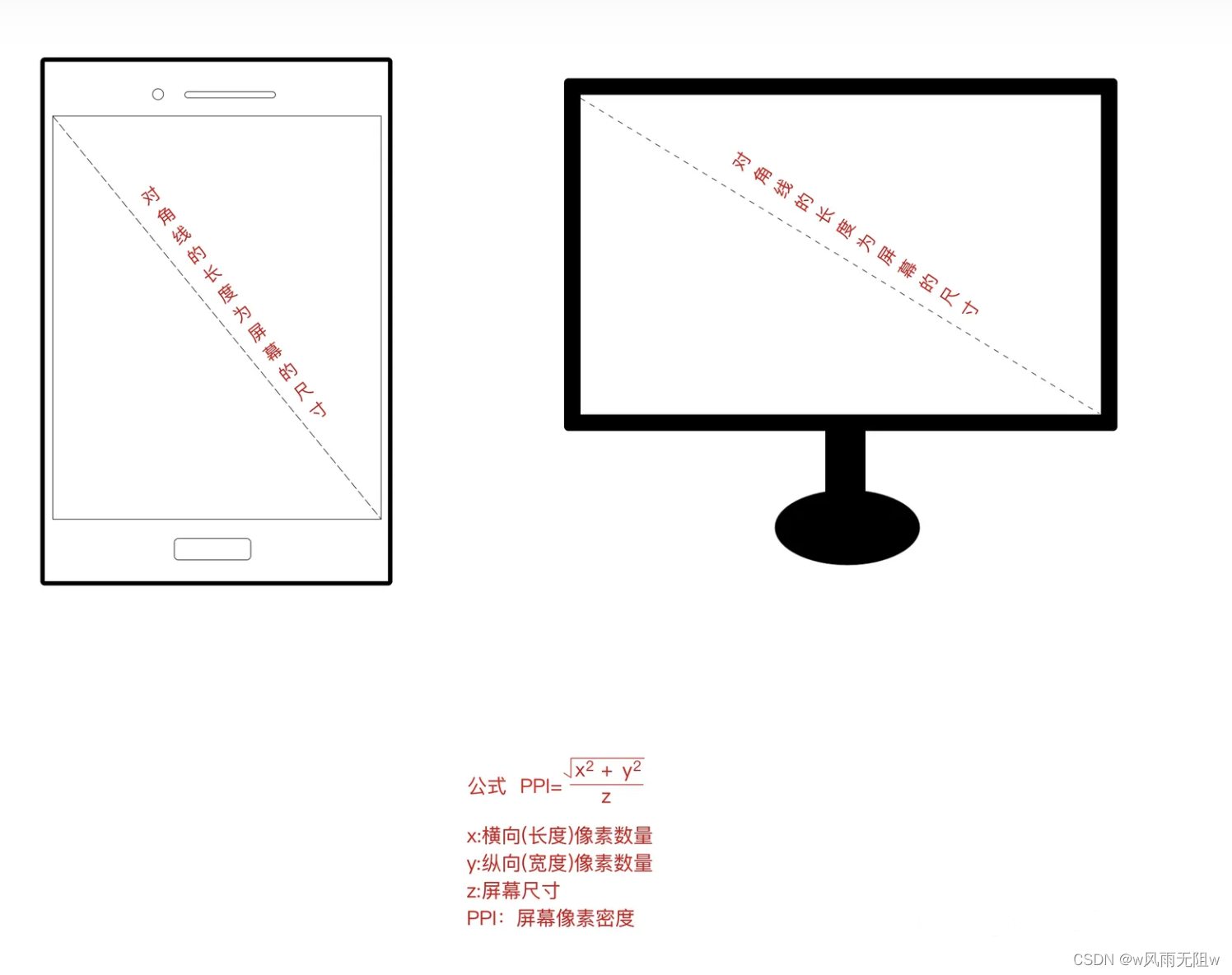
  • Question: What does √ (width pixels ^ 2+height pixels ^ 2) mean?

Pythagorean theorem: a 2+b 2=c ^ 2 The sum of the squares of the two right angled sides is equal to the square of the hypotenuse.

actually √ (width pixels ^ 2+height pixels ^ 2) The purpose is to get the number of diagonal pixels on the screen.

According to the number of horizontal and vertical pixels, use Pythagorean theorem to calculate the diagonal square, and then square it to get the number of diagonal pixels.


As shown below:
 Please add a picture description


  • Example of PPI calculation

    Suppose we need to calculate the dpi (pixel density) of the MacBook Pro 13 inch model

Parameters are shown in the figure:

 Insert picture description here


 var ppi = Math.sqrt(2560 * 2560 + 1600 * 1600) / 13.3; console.log(ppi); //≈ two hundred and twenty-seven

(3) PPI based screen grading

Depending on the value of pixels per inch of the screen, Android divides the screens of tablets and mobile phones into the following categories:

Density name Pixels per inch Icon size
Low Density (LDPI) ~120dpi 36 x 36 px
Medium Density (MDPI) 120dpi ~ 160dpi 48 x 48 px
High Density (HDPI) 160dpi ~ 240dpi 72 x 72 px
Ultra High Density (XHDPI) 240dpi ~ 320dpi 96 x 96 px
Ultra Ultra High Density (XXHDPI) 320dpi ~ 480dpi 144 x 144 px
Ultra Ultra High Density (XXXHDPI) 480dpi ~ 640dpi 192 x 192 px

(4) , resolution Relationship between DPI and PPI

  • Resolution determines the total number of pixels of the entire screen or image, regardless of screen size.

  • PPI determines the pixel density per inch on the screen at the same resolution. PPI=resolution/screen size (inches)

  • DPI and PPI are equivalent in digital display equipment. But in the field of printing, DPI describes the resolution of the printer, not the resolution of the display device.


III Px, dp, sp unit conversion


In Android, we have three commonly used length units: px The conversion relationship between dp and sp is as follows:

1、 px (pixels)

  • Pixel is the smallest display unit on the screen.
  • Px is the actual number of pixels on the screen and is an absolute length unit.
  • It is independent of the screen density of the device, so the same px value will occupy different physical dimensions on devices with different resolutions.

2、 dp (density-independent pixels)

  • Dp is a relative unit of length, independent of screen density.
  • 1 dp is equal to 1/160 inch. Under different screen densities, the same dp value will occupy the same physical size.
  • This is the most commonly used length unit in Android development, because it can adapt to different screen densities.

3、 sp (scale-independent pixels)

  • Sp is also a relative length unit, which is used to set font size.
  • Similar to dp, it also scales according to the user's font size settings.
  • Normally, The conversion ratio of sp and dp is 1:1, but if the user changes the system font size setting, The sp will change accordingly, while the dp will not.

The following code demonstrates px Conversion between dp and sp:

 import  android . content . Context ;
 import  android . util . DisplayMetrics ;
 import  android . util . TypedValue ;

 public  class  UnitConverter  {
     public  static  int  dpToPx ( Context context, float dp )  {
         DisplayMetrics displayMetrics = context . getResources ( ) . getDisplayMetrics ( ) ;
         return  Math . round ( dp * displayMetrics . density ) ;
     }

     public  static  int  pxToDp ( Context context, float px )  {
         DisplayMetrics displayMetrics = context . getResources ( ) . getDisplayMetrics ( ) ;
         return  Math . round ( px / displayMetrics . density ) ;
     }

     public  static  int  spToPx ( Context context, float sp )  {
         return  Math . round ( TypedValue . applyDimension ( TypedValue . COMPLEX_UNIT_SP  sp, context . getResources ( ) . getDisplayMetrics ( ) ) ) ;
     }

     public  static  int  pxToSp ( Context context, float px )  {
         return  Math . round ( px / context . getResources ( ) . getDisplayMetrics ( ) . scaledDensity ) ;
     }
 }

Example of use:

 //Convert 20dp to px
 int pixels =  UnitConverter . dpToPx ( this  20f ) ;

 //Convert 100px to dp
 int dp =  UnitConverter . pxToDp ( this  100f ) ;

 //Convert 16sp to px
 int fontPixels =  UnitConverter . spToPx ( this  16f ) ;

 //Convert 32px to sp
 int scaledPixels =  UnitConverter . pxToSp ( this  32f ) ;

Through these conversion functions, we can convert between different length units to ensure that under different screen densities, The size of UI elements should be consistent with the font size.


Conclusion:

Through the study of this article, I believe I have mastered the core knowledge of Android multi screen adaptation. However, with the continuous updating and iteration of mobile devices, the challenges of screen adaptation are also changing. In addition, optimization strategies for different scenarios also need to be understood and practiced by developers. Let's continue to explore more exciting content of Android multi screen adaptation!

  • thirty-four
    give the thumbs-up
  • step on
  • ten
    Collection
    Think it's good? One click collection
  •  Reward
    Reward
  • one
    comment
MagicIndicator is a powerful indicator library that can help us easily implement various styles of ViewPager indicators. This article will introduce how to use MagicIndicator to create the myriads of changes ViewPager indicator for. 1. Import dependency database Add the following dependencies in the build.gradle file of the app: ``` dependencies { implementation 'com.github.hackware1993:MagicIndicator:1.7.0' } ``` 2. Add MagicIndicator to the layout file We can add a MagicIndicator as the indicator of ViewPager in the layout file, for example: ``` <com.github.chenglei1986.navigationbarlib. MagicIndicator android :id="@+id/magic_indicator" android :layout_width="match_parent" android :layout_height="48dp"/> ``` 3. Create ViewPager We need to create a ViewPager and bind it to the MagicIndicator. For example: ``` ViewPager viewPager = findViewById(R.id.view_pager); viewPager.setAdapter(adapter); MagicIndicator magicIndicator = findViewById(R.id.magic_indicator); magicIndicator.setNavigator(navigator); ViewPagerHelper.bind(magicIndicator, viewPager); ``` In the above code, we create a ViewPager and associate it with Adaptation To bind. Then, we created a MagicIndicator and bound it with ViewPager. We also used the ViewPagerHelper class to bind MagicIndicator and ViewPager together. 4. Create Navigator The navigator is used to control the style and behavior of the ViewPager indicator. We can use the CommonNavigator class to create a navigator, for example: ``` CommonNavigator navigator = new CommonNavigator(this); navigator.setAdapter(new CommonNavigatorAdapter() { @Override public int getCount() { return titles.length; } @Override public IPagerTitleView getTitleView(Context context, int index) { ColorTransitionPagerTitleView titleView = new ColorTransitionPagerTitleView(context); titleView.setNormalColor(Color. GRAY); titleView.setSelectedColor(Color. WHITE); titleView.setText(titles[index]); titleView.setOnClickListener(new View. OnClickListener() { @Override public void onClick(View v) { viewPager.setCurrentItem(index); } }); return titleView; } @Override public IPagerIndicator getIndicator(Context context) { LinePagerIndicator indicator = new LinePagerIndicator(context); indicator.setColors(Color. WHITE); return indicator; } }); ``` In the above code, we created a CommonNavigator and set its Adaptation Device. Adaptation We need to implement the number of indicators returned by the getCount method, The getTitleView method returns the view of each indicator, The getIndicator method returns the style of the indicator. In this example, we use ColorTransitionPagerTitleView to create the indicator's view, which can automatically perform color transition when switching the selected state. We also use the LinePagerIndicator to create the style of the indicator, which is a horizontal line with white color. 5. Operation procedure Now that we have finished setting up the MagicIndicator, we can run the program and view the effect. You can try changing the style of the navigator, such as changing the color, size, and shape of the indicator, to achieve different effects. summary In this article, we introduced how to use MagicIndicator to create the myriads of changes ViewPager indicator for. By using MagicIndicator, we can easily create different styles of ViewPager indicators to improve the user experience.

Is "relevant recommendation" helpful to you?

  • Very unhelpful
  • No help
  • commonly
  • to be helpful to
  • Very helpful
Submit
Comments one
Add Red Packet

Please fill in the red envelope greeting or title

individual

The minimum number of red packets is 10

element

The minimum amount of red packet is 5 yuan

Current balance three point four three element Go to recharge>
To be paid: ten element
Achieve 100 million technicians!
After receiving, you will automatically become a fan of the blogger and the red envelope owner rule
hope_wisdom
Red packet sent

Reward the author

W rain or shine w

Your encouragement will be the greatest impetus for my creation

¥1 ¥2 ¥4 ¥6 ¥10 ¥20
Scan code for payment: ¥1
Obtaining
Scan code for payment

Your balance is insufficient, please change the scanning code to pay or Recharge

Reward the author

Paid in element
Payment with balance
Click to retrieve
Scan code for payment
Wallet balance zero

Deduction description:

1. The balance is the virtual currency of wallet recharge, and the payment amount is deducted at a ratio of 1:1.
2. The balance cannot be directly purchased and downloaded, but VIP, paid columns and courses can be purchased.

Balance recharge