
Harmonyos sans font
-
Software size: 49.70 MB -
Software language: Simplified Chinese -
Updated: 2021-07-27 -
Software type: Domestic software/font collection -
Operating environment: WinAll, WinXP, Win7, Win10 -
Software license: freeware -
Official homepage: http://www.xz7.com/ -
Software level:
-
Newsgothicbtbold font pack free 
Founder Cool (home version) PC terminal v1.0.0.1 PC version 
Font fitting room Chinese version 
Bird stroke order Stroke order table Latest version -
The stroke order of leather The stroke order of leather is the latest pdf version -
The stroke order of the mountain The latest version of the stroke order table
-
Introduction -
Download address -
Boutique recommendation -
Related software -
Netizen comments
Introduction to harmonyos font free version:

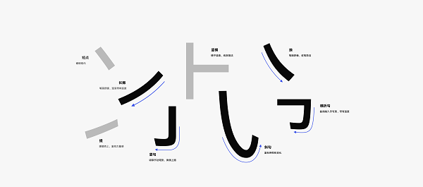
font style
matters needing attention:
Download address
-
Pc version
Harmonyos sans font free version
Boutique recommendation
-
Hanyi font

Hanyi font More+
-
Harmonyos sans font free version 49.70 MB / Simplified Chinese Free version download -
Hanyi Kui Su w font ttf computer version 5.47 MB / Simplified Chinese Computer version download -
Hanyigang Art&Sports Jane ttf Free Edition Full Edition 648.00 KB / Simplified Chinese Full version download -

Hanyi Meow Soul Free Body W Simplified Free Edition 4.10 MB / Simplified Chinese Free version download -
Hanyi Shengong Simplified Free Official Edition 2.60 MB / Simplified Chinese Official edition download -
Hanyi doll seal simplified ttf free version 2.74 MB / Simplified Chinese Free version download -
Hanyi Variety Font Simplified Free Edition 1.34 MB / Simplified Chinese Free version download -
Hanyi Hangkai Traditional Font Free Edition 5.66 MB / Simplified Chinese Free version download
Netizen comments
Ranking in this category
-
one Founder Xiaobiao Song Simplified Font Official Version v3.0 Computer Version -
two Huakang pop font installation package ttf version -
three Founder Big Black Simplified ttf installation package -
four Fzltthk gbk1 0 font software (Founder Lanting black gbk font) ttf version -
five XXFarEastFont Free Edition -
six Fzltzhk gbk Free Edition Official Edition -
seven Words by literary boldface ttf free version -
eight Harmonyos sans font free version -
nine Founder Lanting Large Black Simplified GBK Font Full Version -
ten Founder Lanting bold black simplified gbk free version
This category of recommendation
-
one World of Warcraft Yahei bold font free version -
two Wow World of Warcraft Font Collection Free Edition -
three Mini Hanzhen Guangbiao.ttf free version -
four Wisdom Cheese Font v6.0 Free Edition -
five Caotanzhai Mao font computer version -
six Founder Xu Jinglei font ttf official version -
seven Font fitting room Chinese version -
eight The official version of montserrat series fonts -
nine Founder Big Black Simplified ttf installation package -
ten Founder Jinglei Simplified ttf Official Version


Necessary for installation
-

WinRAR official 64 bit -

Google Chrome -

ITunes 32-bit -

Sogou Pinyin Input Method Computer Version -

Kugou Music Player PC Edition -

360 security guard computer version -

IQIYI pps video client -

Baidu online disk PC version -

Tencent Computer Housekeeper Win10 Special Edition -

WeChat 2024 latest computer version -

Tencent app pc -

Wps office 2016 professional edition


-
chat -
Qq computer version -
WeChat computer version -
Yy voice -
skype -
video -
Tencent Video -
IQIYI -
Youku Video -
Mango tv -
clip -
Love editing -
Cut and reflect -
Ulead VideoStudio -
adobe premiere -
music -
Qq music -
NetEase cloud music -
Cool dog music -
Kuwo Music -
browser -
360 Browser -
Google Browser -
Firefox -
Ie browser -
to work in an office -
Nail -
Enterprise WeChat -
wps -
office -
typewriting -
Sogou input method -
Qq input method -
Five stroke input method -
iFlytek Input -
compress -
360 Compression -
winrar -
winzip -
7z decompression software -
translate -
Google Translate -
Baidu Translate -
Jinshan Translation -
English to Chinese software -
Anti-Virus -
360 Antivirus -
360 Security Guard -
Tinder software -
Tencent Computer Housekeeper -
P diagram -
Beautiful pictures -
photoshop -
nEO iMAGING -
lightroom -
programming -
python -
C language software -
Java development tools -
vc6.0 -
Online disk -
Baidu online disk -
AliCloud disk -
115 network disk -
Celestial wing cloud disk -
download -
Thunder -
Qq cyclone -
Emule -
utorrent -
negotiable securities -
Huatai Securities -
gf securities -
Founder Securities -
Southwest Securities -
mailbox -
Qq mailbox -
outlook -
Alibaba Email -
icloud -
drive -
Drive sprite -
Drive life -
Network card driver -
Printer drive