This site will also continue to provide a number of beautiful English font conversion.
The number of English letters is very small, and the form is simple, showing basic geometric shape, although the English fonts converted online are also from Handwriting But most of the English letters drawn by the calligraphers are Pen character As a result, the overall image of today's English fonts is clean and concise, with clear appearance and clear outline. The basic attributes of the generated English font are mainly reflected in the style, serif, x height and other factors after font conversion. The basic strokes in English typefaces include main line, horizontal stroke, shoulder, peak, ridge, arm, thread, line, mouth, leg and new space formed after writing, such as word cabinet, bowl, valley, ring and fork. These small parts together form the image of English font. The main factors that affect the style of English font conversion include case, weight, contrast, width, and slant.
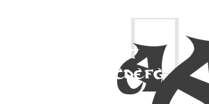
Upper case and lower case: each letter in the English alphabet has upper case and corresponding lower case letters. Lower case letters vary widely and can be quickly recognized in text. There are many straight lines in upper case letters, which are slightly formal and serious. The upper case letters of English fonts have more regular geometric beauty than the lower case letters in shape, and the geometric sense of their basic shapes placed separately and the complementarity of multi letter arrangement are very strong.
Word weight: In the process of conversion, some well-developed English fonts will have multiple font types with different word weights. The glyphs with different weight in a font are based on the basic composition of the font, and have different stroke widths and weights. The glyphs with different weight can also show completely different effects.
Contrast: The strokes of letters in English fonts can be uniform in thickness, or can change significantly. The greater the change of font strokes, the greater the contrast of fonts.
Word width: In English font online converter, the proportional word width is based on the word width of capital letter M. The font with narrower width is called narrow body, while the font with wider width is called widened body.
Font inclination: Italic characters are italics created by humanists in the Renaissance period. They slant 12 to 15 degrees to the right, mimicking the writing inclination. However, at present, our website does not support online conversion of slanted English fonts.