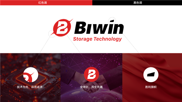

Shenzhen Baiwei Storage Technology Co., Ltd. today announced the launch of a new brand logo. The new graphic logo consists of a circle and two geometric cones, symbolizing the company's globalization and technology drive The speed and strength displayed under the strategy of. The circular outline represents the company's global development strategy of "based in China and facing the world", while the sharp cones on both sides imply speed and quality, symbolizing the company's continuous progress on the road of technological innovation.
It is understood that the main products and services of Baiwei Storage cover embedded, consumer, industrial storage and advanced sealed test business, and it has made layout in chip IC design and other fields. The company has mastered the mass production capacity of advanced processes such as 16 layer Die, 30~40 μ m ultra-thin Die, and multi chip heterogeneous integration, reaching the world-class level.
Baiwei storage products are widely used in information technology fields such as mobile intelligent terminals, PCs, industrial terminals, data centers, smart cars, mobile storage, etc. In addition, the company also cooperates with HP, Acer and other PC enterprises to provide licensing services for users of retail DIY storage products. Acer Predator Storage is one of the brands operated by Baiwei.
This article is an original article. If it is reproduced, please indicate the source: Shenzhen Baiwei Storage Launches New Brand Identity to Support Globalization Strategy https://news.zol.com.cn/874/8741882.html
https://news.zol.com.cn/874/8741882.html
news.zol.com.cn
true
Zhongguancun Online
https://news.zol.com.cn/874/8741882.html
report
seven hundred and fifteen
Shenzhen Baiwei Storage Technology Co., Ltd. today announced the launch of a new brand logo. The new graphic logo is composed of a circle and two geometric cones, symbolizing the speed and strength of the company under the globalization and technology driven strategy. The circular outline represents the company's globalization development strategy of "based in China and facing the world", while the sharp taper on both sides symbolizes speed and quality
